Project Structure
Project has this folder hierarchy:
Application # Root folder
├─ build # webpack and vue-loader scripts
├─ config # webpack and vue-loader config
├─ src
│  ├─ components # contains all Vue components used in project
│  ├─ i18n # translations
│  ├─ store # vuex store
│  │  ├─ modules # vuex modules
│  │  ├─ constants.js # project constants
│  │  └─ index.js # store file that combines all modules
│  ├─ utils
│  │  ├─ vue-cordova # cordova integration. You can add cordova plugin wrappers here
│  │  ├─ api.js # encapsulates api requests
│  │  ├─ server.js # sends requests to server
│  │  └─ utilities.js # contains some commonly used functions
│  ├─ views # vue views
│  ├─ App.vue # main application view
│  ├─ main.js # application entry point
│  └─ router.js # routes config
├─ static # static content
│  ├─ css
│  │  └─ base.css # global css, like fonts declaration
│  ├─ font
│  └─ images
├─-test
│  └─ data # contains mock server class that provides sample data
├─ index.html # app main file
└─ package.json # npm package
Below we will describe generic components that are used in the project:
Button
Raised button.

<BaseButton :label="'SAVE'" @click="save($event.target)" :class-name="'custom-css-class'"/>
Flat button
Text button.

<BaseButtonFlat :label="'CLOSE'" @click="close" :class-name="'custom-css-class'"/>
Navigation button
Button for navigation bar.

<BaseNavigationButton :label="'CONFIGURATION'" :icon="'icon-cog'" @click="openConfiguration" />
Text
Field for entering single line of text.
<BaseText :label="'CITY'" :value="city" :errors="errors['city']" @change="setCity($event.target.value)" />
Textarea
Field for entering multiple lines of text.
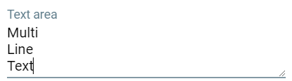
 <BaseTextarea :label="'DESCRIPTION'"
               :value="description"
               :errors="errors['description']"
               :rows="3"
               @change="setDescription($event.target.value)" />
Checkbox
Component for setting true/false flag.
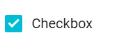
 <BaseCheckbox :label="'GLOBAL'"
               :value="isGlobal"
               :field-name="'isGlobal'"
               :errors="errors['isGlobal']"
               @change="setIsGlobal($event.target.checked)" />
Dropdown
Component for selecting single value from dropdown.

<BaseDropdown :label="'CITY'"
              :value="city"
              :items="cities"
              :errors="errors['city']"
              @change="setCity($event.target.value)" />
Radio
Radio buttons.
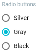
<BaseRadio :label="'COLOR'"
           :value="color"
           :items="colors"
           :errors="errors['color']"
           :field-name="'color'"
           @change="setColor($event.target.value)" />
Segmented
Component for selecting single value.

<BaseSegmented :value="color"
               :items="colors"
               @change="setColor" />
Date picker
Component for selecting date and optional time.
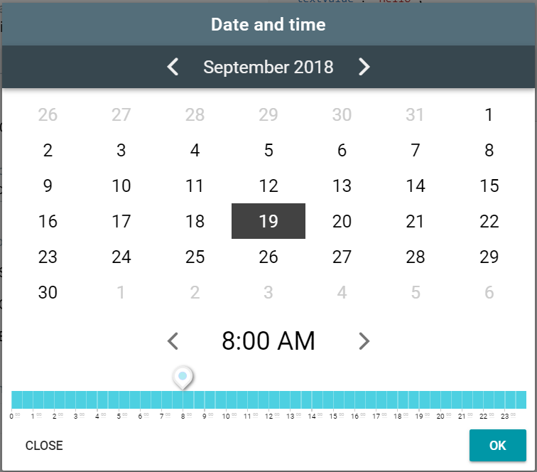
 <BaseDateTime :label="'START'"
               :show-time="true"
               :date-string="startString"
               :title="'START'"
               :handler-action="'form/setStartString'"
               :errors="errors['start']"
               @change="setStartString({dateString:$event.target.value})" />
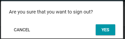
Confirmation
Component for showing confirmation before doing some action.
// actions
const actions = {
    ...
    confirmAction(store) {
        store.dispatch('confirmation/open',
            {
                title: 'CONFIRM_ACTION_PROMPT',
                handlerAction: 'module/action',
                handlerActionParams: null
            },
            { root: true });
    },
    action(store) {
        ... actual action ...
    }
};
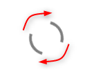
Loader
Component for showing activity indication while form is being loaded.
<BaseLoader v-show="!isLoaded" />
Tabs
Component for showing tabs.
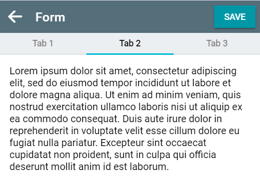
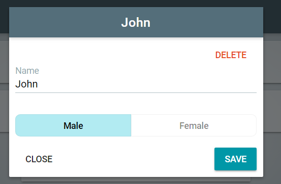
Modal
Modal window component.
 <BaseTabs :value="selectedTab"
           :items="tabs"
           @change="setSelectedTab" />
 <template v-if="selectedTab === 1">
	TAB 1 CONTENT
 </template>
 <template v-if="selectedTab === 2">
 	TAB 2 CONTENT
 </template>
Page
Application page component with navifation bar.
<ThePage :title="'PAGE_TITLE'"
		 :class-name="'custom-css-class'">
    <template slot="left-action">
        ..LEFT ICON/ACTION..
    </template>
    <template slot="right-action">
         ..RIGHT ACTION..
    </template>
    ..CONTENT OF PAGE..
</ThePage>
External page
Page for unauthenticated forms.
<ThePageExternal :title="'PAGE_TITLE'"
                  :class-name="'custom-css-class'">
    ..CONTENT OF PAGE..
</ThePageExternal>